Here is some of the work we have done so far (I'll post some stuff from Josh and James as soon as they give me some!).
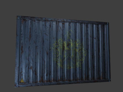
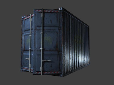
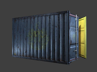
I painted this texture for a cargo container, for my Texture Painting class. I think it came out pretty well. The teacher gave us pretty high standards, something that he would consider acceptable for his own work (hes a texture artist currently working on the next Call of Duty game). I think it turned out pretty well. Took about 10 hours, hand painted in Photoshop. I painted dirt, rust, boot prints, paint splatters, salt stains, etc. I never realized how time consuming texturing can be. I would love to hear suggestions from Matt or Elliott.
(Click for Larger Version)
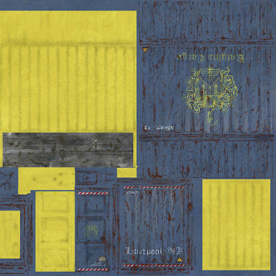
Some early renders (I havent had a chance to make Matts changes):
Here is a ball that Josh hand animated. No dynamics on this one. A sort of back to the basics exercise. Looks good though, much harder than it seems (take it from someone who cant animate at all.
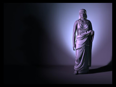
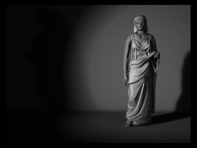
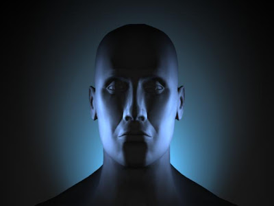
Here are some renders from my Lighting class. Our first homework was to basically do a photoshoot with a model, practicing 3-point lighting. Here are a few of my better shots:
(Click for Larger Versions)
Josh's Nebula:
Thanks

8 comments:
Hey Matt,
The texture looks like a good start.
Some suggestions...
The rust looks too much like a pattern. It you think about how rust develops...rust would appear more where water would sit to allow the oxidization process to take place.
Basically, Add more rust in certain areas and less in others. Try to keep it from looking homogeneous. also, push the blue and the yellow.
Try adding a touch of blue-green into the blue around some of the rust areas. And also try some yellow-green and yellow orange in the yellows in the dark areas. The logos look really nice. Just try to push the textures in some areas and let it go in others. Think of it as an abstract painting. OH! and mix complementary colors together to desaturate certain areas. Try to vary the rust color too.. more orange in some areas, more orange in others. I could go on, but I will stop here. Keep up the good work. It is starting to look really luscious, but it can still be developed.
Hi Matt,
Of course, I think this piece is wonderful! I may be slightly biased. I'd love to see some things from James and Josh, too. You guys must be putting in some serious hours doing work for class but I'm going to assume you are loving it!
We are proud of you all. I don't have to remind you to have fun but I will say stay safe.
:)
Josh,
The ball animations is pretty nice!
The way the ball reacts with the floor is really nice. It seems like it has some backspin before it hits the floor and then the contact sends the spin in the opposite direction.
Cool stuff!
Oh and Matt, while you are painting, you might want to check out a the song "Polka Dot Rose" by Oysterhead.(It's a song about painting!)
Thanks Matt, it was a nice exercise to get me back into animation mode. I did have some trouble getting the bounce back off the wall to look right. It still looks a bit strange to me.
People, try and watch the nebula video in high quality. Its better.
The texture does look pretty nice once you put it on the crate and lit it. Nice start with the nebula, Josh.
Matt, were you allowed to mess with the falloff or decay of the lights? The first couple look nice, the third seems too dark.
School starts today, so i will have more to do than work in ZBrush, Play XBox and check up on you guys. I will visit as often as I can. So, keep posting. Overall nice work so far!
Josh, Nice job on the bouncing ball. It probably looks strange to you 'cuz you've looked at it a zillion times.
I think the action of the ball and its reaction to hitting the wall look very natural. Very cool.
Thank you! We appreciate everyone's feedback.
Hey guys,
Sorry I didn't comment sooner. I was in Boston for a game developer social.
Matt - The container is tight.
Matt B. said it about the rust and saturation. A good example in animation to look at would be “Spirited Away” Look at the bathhouse back stairway and walls when Chihiro is running for the boiler room. The walls tell stories of past paint, abuse, repetitive leaks and drips, life forms and so much more. They record forces of the past. Tell your self the story of the object as you work. Since you have a nice UV layout you can add some naturalistic effects with painter or paint effects to comp in.
The other comment about the renders are the uniform reflectivity and spec highlights. “Rust ain't shiny” as my old time Vermonter neighbor would say. Sorry, you might not have gotten to this yet.
Matt's lighting renders have very different emotional qualities. I will be interested in seeing you push these more. The head at the bottom caught my attention but the pose and light/shadows are too centered and balance. Unnatural shadow in the center of his face.
Josh – The ball is good except the end. A bad keyframe or something. The beginning is pretty convincing. Are you observing a video of a ball bouncing? If not it would be a good idea to.
Nice nebula simulation. I'd like to see a closeup. Are you going to work on it some more? My one primary comment is the camera is out of control. Dynamics fascinate me and I know they can be daunting yet rewarding. You will get a lot out of this class for sure.
James What are you up to?
Post a Comment